WEBSITE AND APP
Keeping Consistency
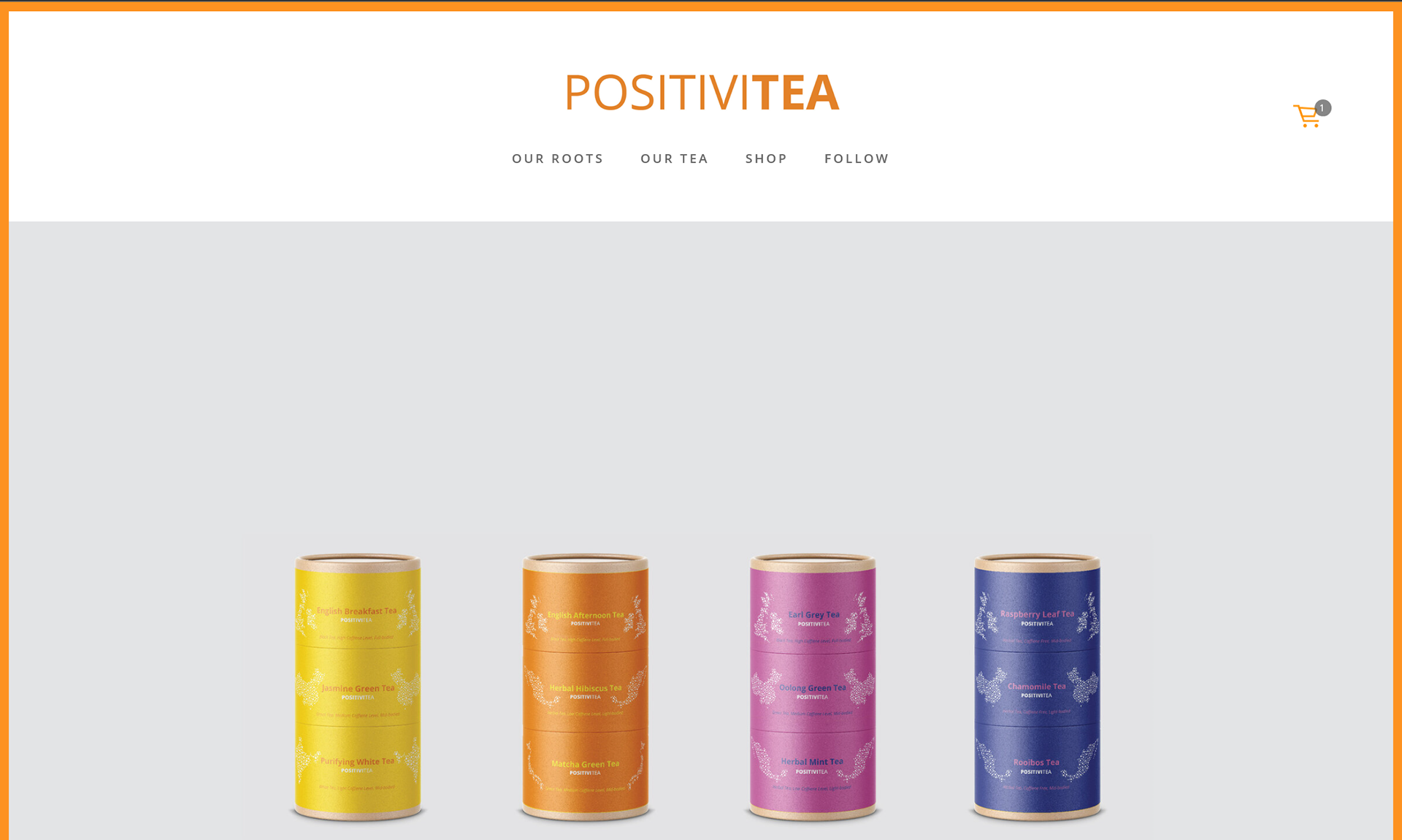
When building out items across multiple platforms it is important to maintain consistent usage of font, color, content, and imagery. This will provide a sense of unity and familiarity with the brand. The goal is to make each project recognizable to the consumer. The following image is a screenshot from the landing page of my brand's website. It is minimalistic with colorful accents.
Shop
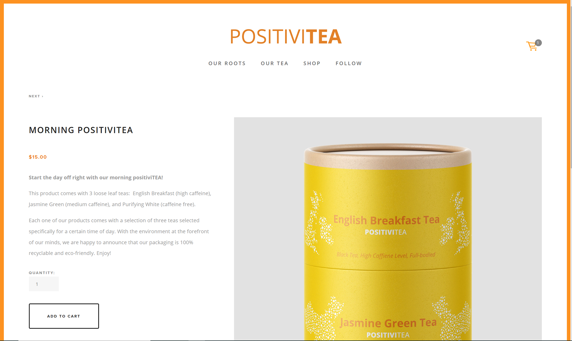
Next is a screenshot from the website's shop. Emphasis is given to the product, the product title, and the "ADD TO CART" button. I want for the consumer to pay close attention to these areas. I want to eliminate any confusion about what the product is and how to purchase it.
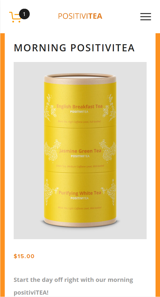
Mobile Screenshot
Finally, I have an example of what one would see on an app. Notice that the design is similar to what the consumer would see on the website. I kept the same branding across the board so that each platform is connected, which will minimize confusion for the consumer.