PACKAGING
Choosing Materials
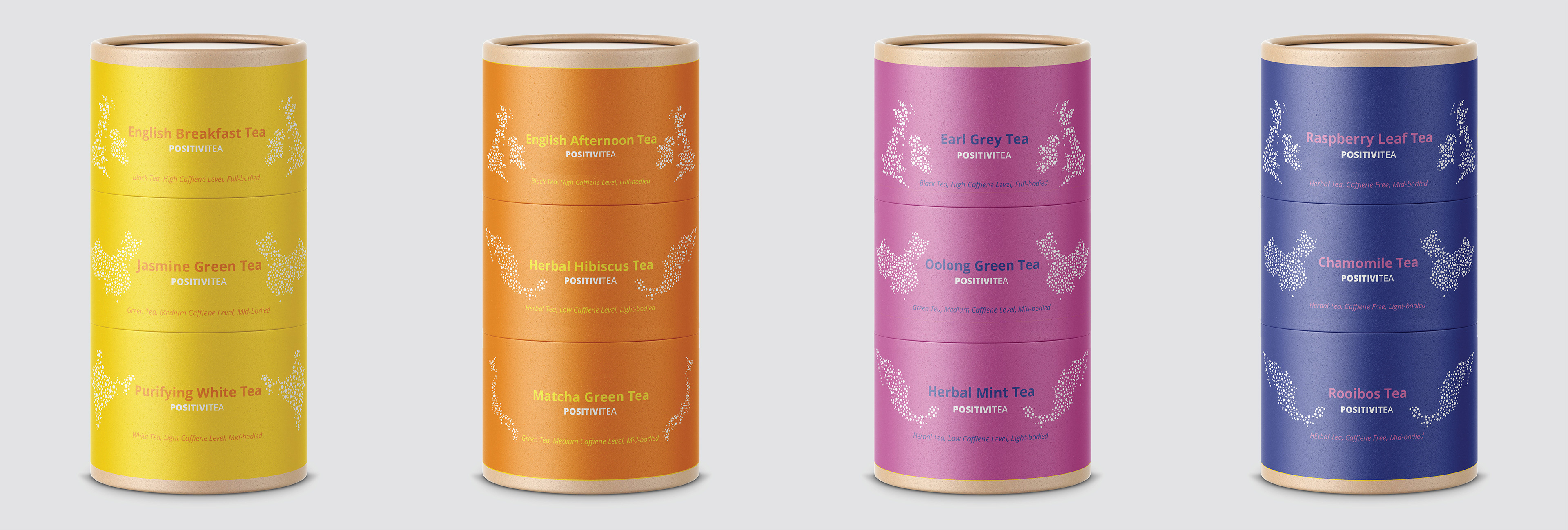
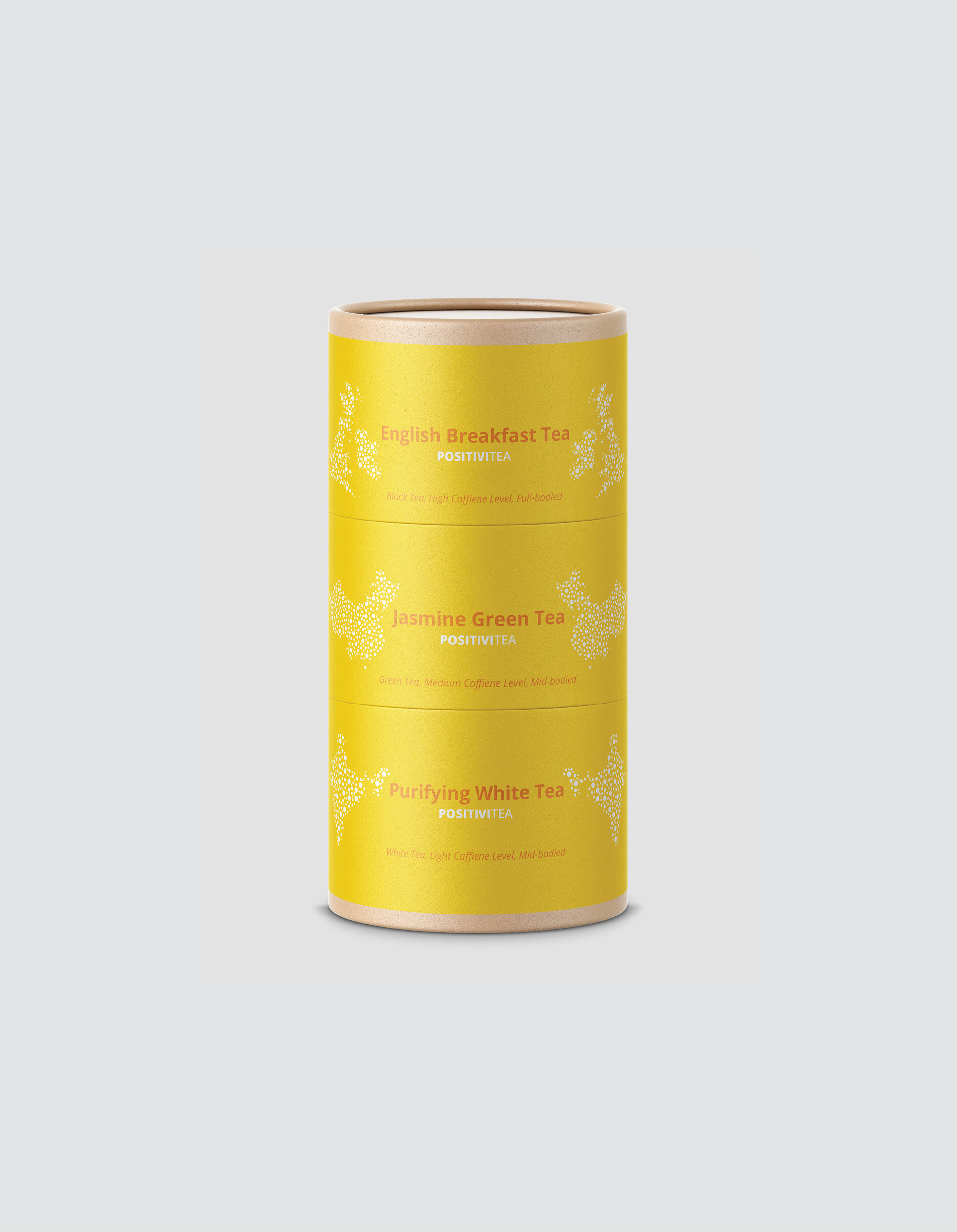
During my initial research, I found that many of my competitors were marketing eco-friendly and environmentally conscious products. I knew that I would need to create something that would compete with these other brands, and connect with my own brand's messaging. I chose to implement stackable cardboard containers with the intention of making them recyclable.
Adding Illustrations
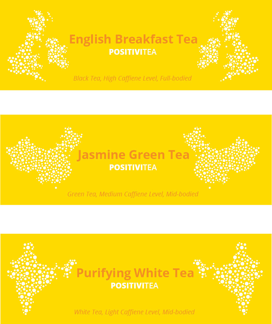
The same style of illustration is used on the sides of my packaging that I created at the beginning of this project. These illustrations are countries that the coordinating tea either originates from, is highly produced by, or is consumed regularly by its people. The following image is the isolated labels from the packaging.
Coordinating Colors
Each package has the same shape, materials, fonts, and imagery style. Because color is such a strong element in my branding, I decided that these packages needed more than white text. I alternated the colors of the tea names and descriptions so that each product appears to be visually "linked" to one another.